

Overview
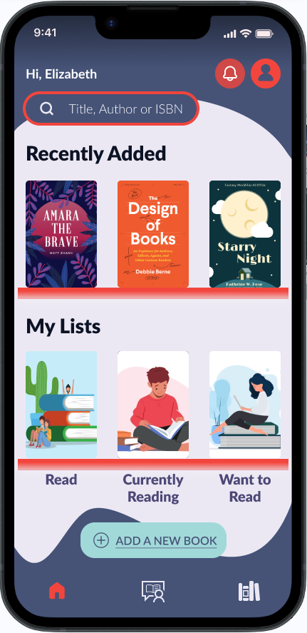
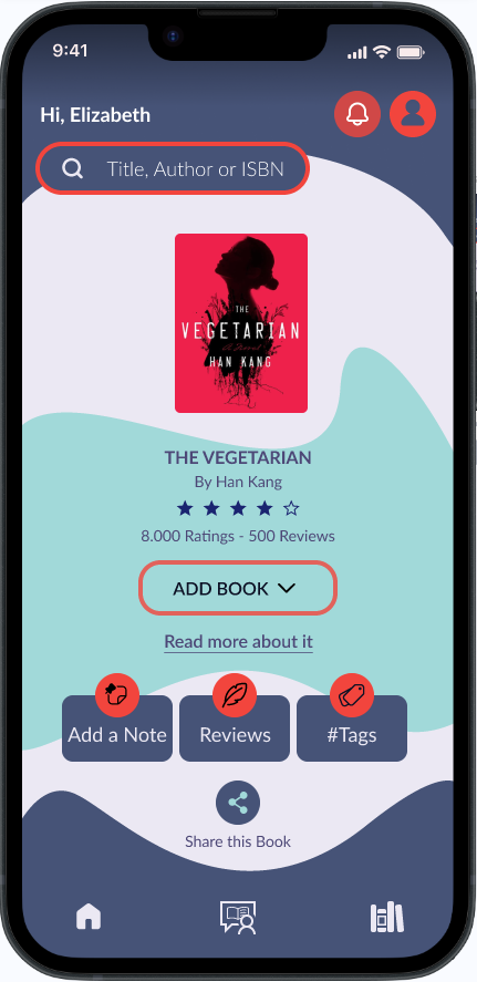
Bhuku is a mobile app designed for book lovers to organize their personal libraries, track reading progress, discover new books, and connect with a community of readers.
The project explored how a modern, user-centered experience could simplify book management while making reading more engaging through personalization and intuitive design.
The Challenge
Existing book-tracking platforms often feel outdated, cluttered, and difficult to navigate. Users rely on multiple apps to organize their books, discover new titles, and monitor their reading progress, creating a fragmented experience.
The challenge was to design a single platform that streamlines book management while encouraging users to read more through a clean interface and personalized features.
The Solution
Design an intuitive book-tracking app that helps readers build and organize their personal library, track reading progress, discover personalized recommendations, and connect with a community of book lovers. The experience simplifies book management through an easy navigation, smart search, and personalized features that encourage consistent reading habits.
Research
I wanted to understand how people discover, track, and share books, what motivates them to read, and what challenges they face with current tools. By exploring diverse reading behaviors, from casual readers to book lovers, I aimed to identify opportunities for Bhuku to offer a more fresh, visual, and motivating experience for readers.
Methodologies
- Competitive Analysis
- User Interviews
- Online Survey
- Usability Testing
Competitive Analysis

Strengths
- Large user base
- Big data base
- Strong community
- Integration with Amazon
Weaknesses
- Outdate and clunky UI
- Bland recommendation algorithm
- Community moderation issues

Strengths
- Richer metrics
- More personalization
- Clean and modern UI
- Less biased
Weaknesses
- Smaller community
- Fewer social features
- Features behind paywall
- Small database
Strengths
- Detailed read tracking
- Easy to use and fun UI
- Useful features
- Motivation via goals setting
Weaknesses
- Limited free version
- Features behind paywall
- Less social features
- Bugs reported by users
User Interviews
A total of six participants (aged 22–50) were interviewed to try to represent a wide range of reading habits, professions, and digital engagement levels.
Across interviews, reading habits were irregular and mood-based rather than routine.
Most participants do not track books formally, and those who tried Goodreads, for example, eventually abandoned them due to frustration, time, or poor design.
The social aspect of reading exists, but it’s light and private, through WhatsApp, DMs, or casual conversations.
Key Research Insights
Research revealed several recurring patterns:
- Readers often switch between multiple apps for different reading activities.
- Users wanted a faster way to organize and search their libraries.
- Personalized recommendations were valued more than generic bestseller lists.
- Visual organization made libraries feel easier to manage.
- Many participants wanted to create custom reading collections based on moods, genres, or personal goals.
These insights became the foundation for the product strategy and feature prioritization.
Define
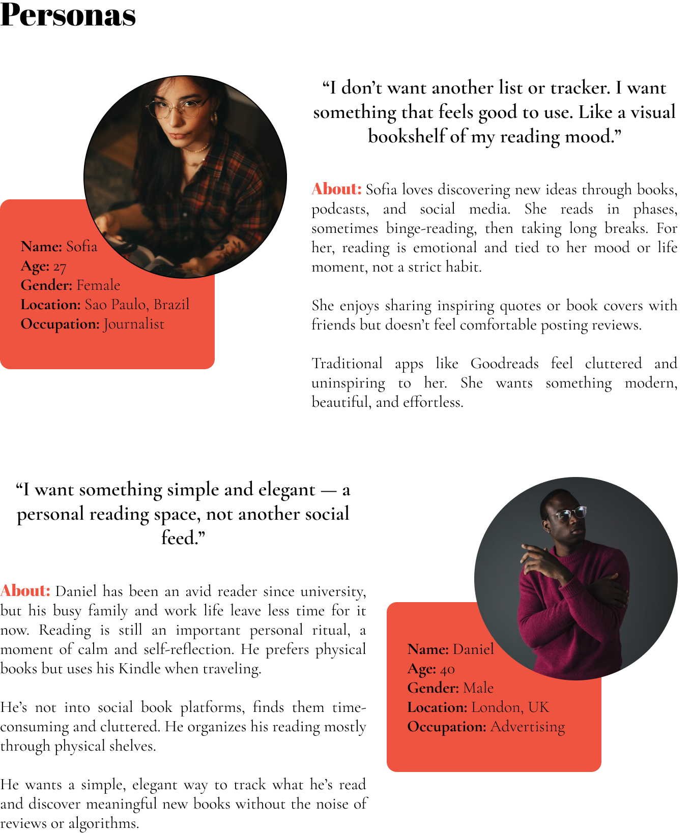
Using affinity mapping, I synthesized the research findings into clear design opportunities and created personas, information architecture, and user flows focused on the most common user tasks.
The solution centered on reducing friction when adding, organizing, and discovering books while making the experience feel enjoyable rather than purely functional.
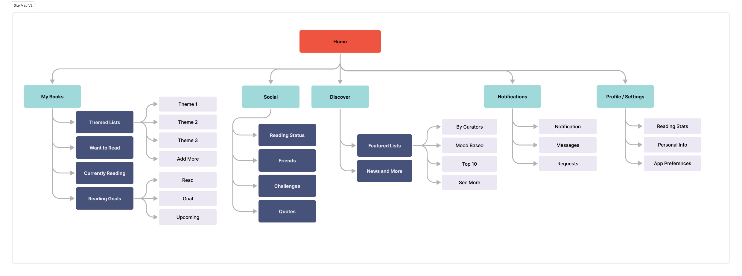
Information Architecture
The app architecture focused on helping users quickly complete their primary tasks, reducing unnecessary navigation while keeping frequently used actions accessible.
User Flows
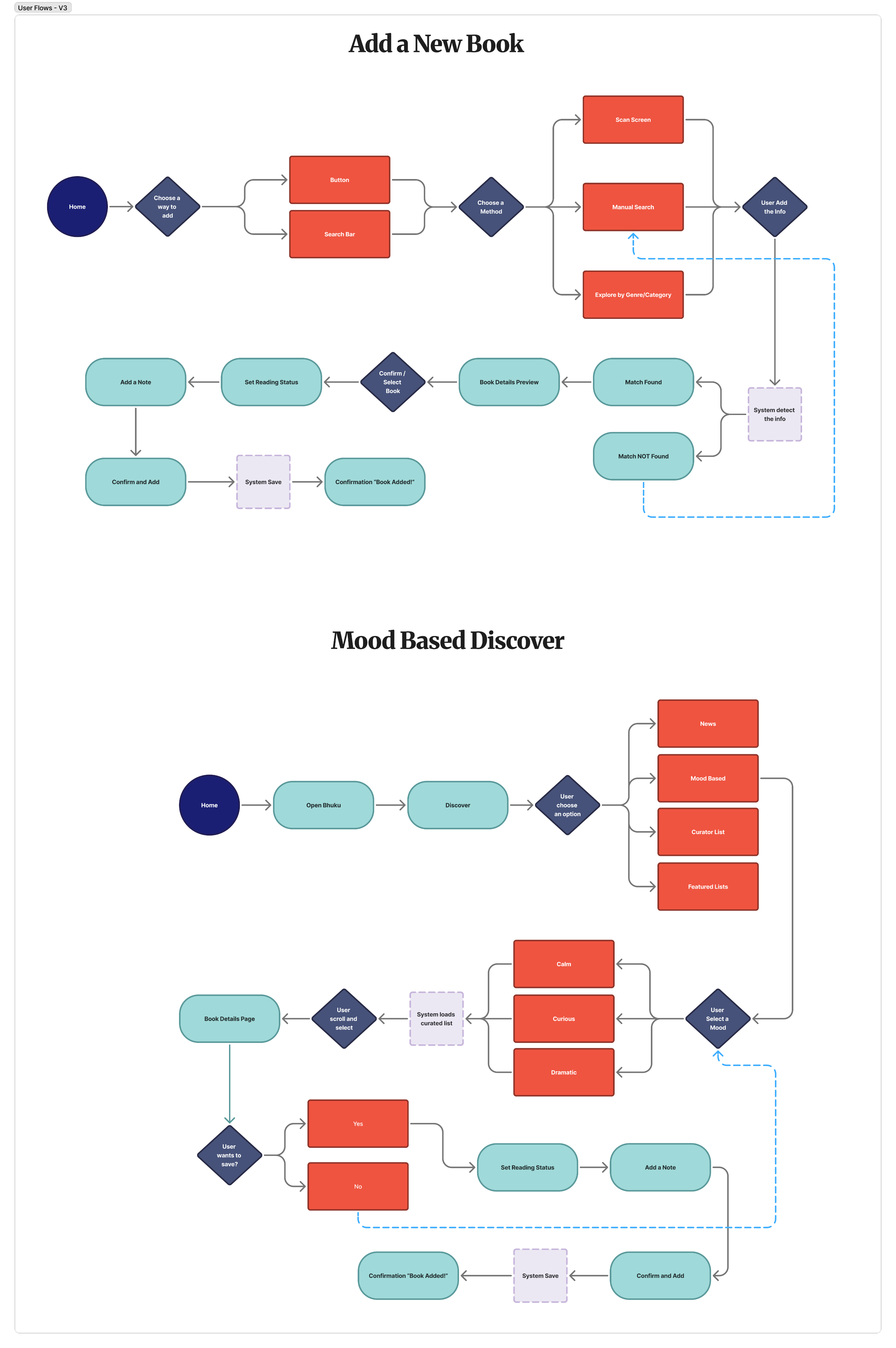
Core user flows included:
- Searching and saving a new book
- Access mood discover list.
Add a New Book
Mood Based Discover
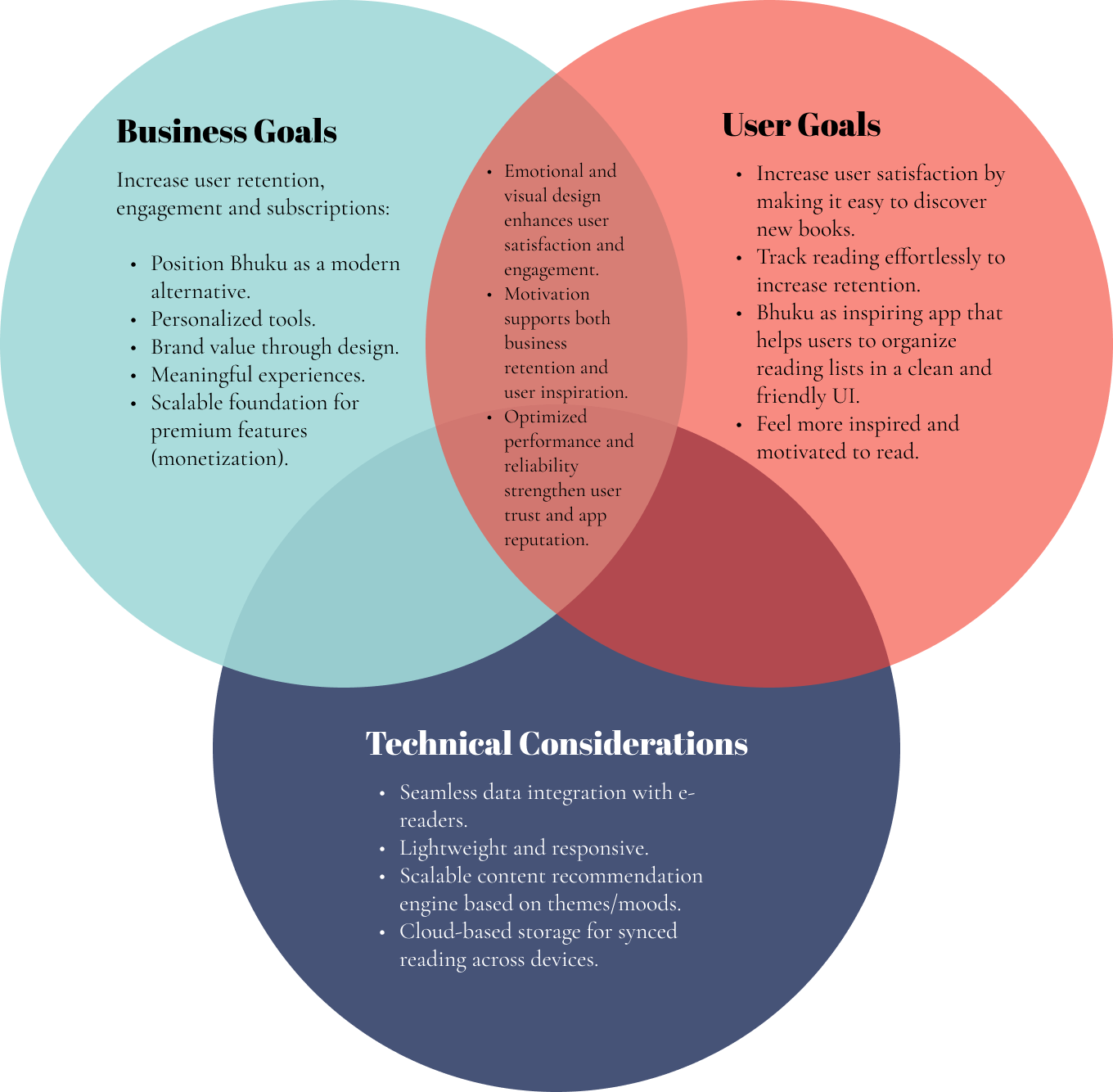
Project Goals
Design
The design process began with paper sketches to rapidly explore ideas before moving into wireframes and high-fidelity designs in Figma.
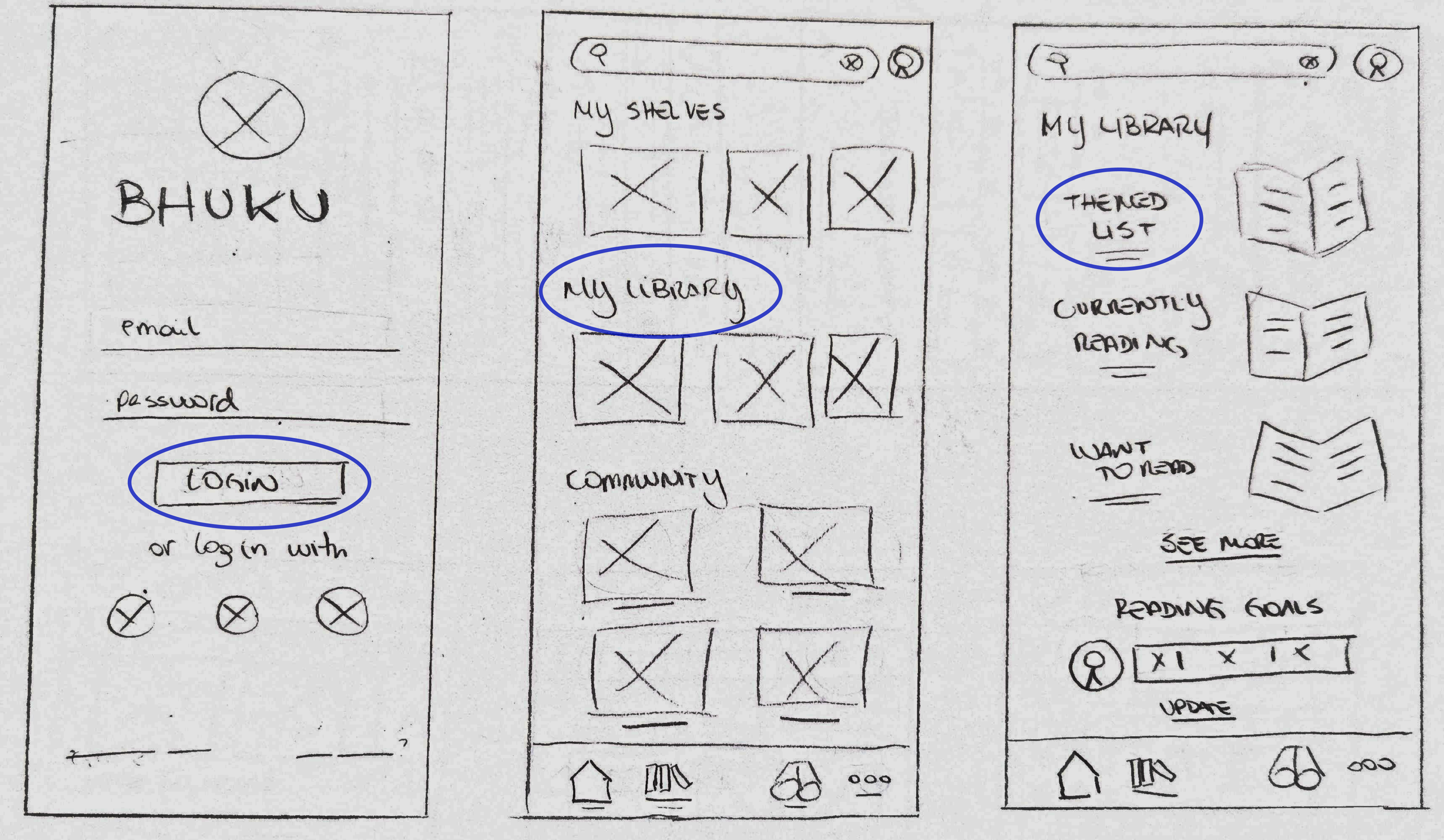
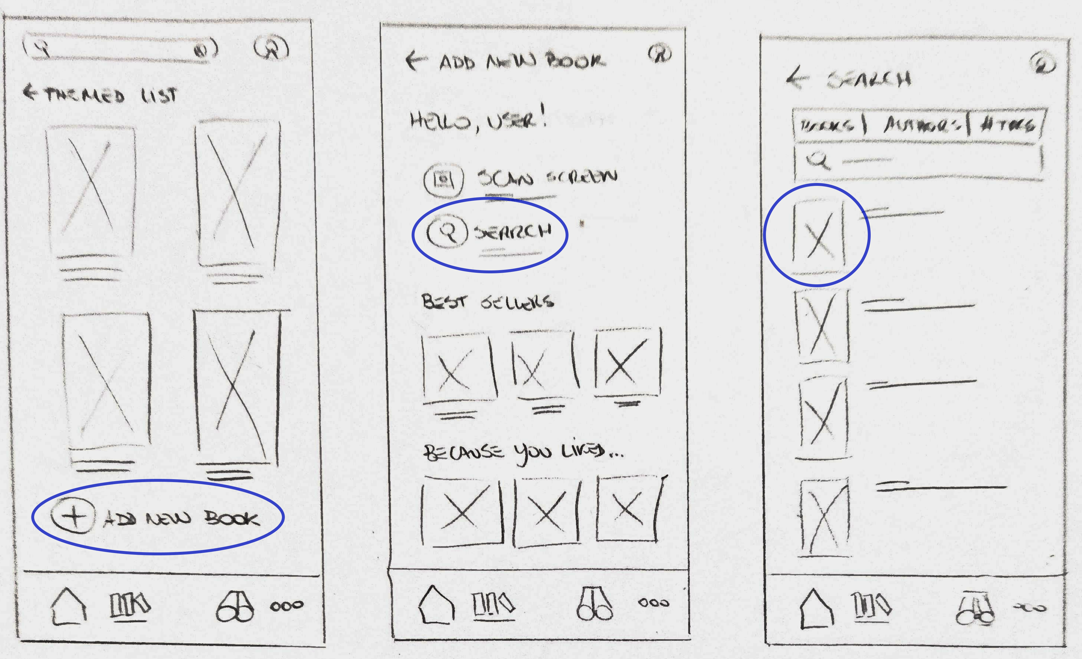
Throughout the project, multiple design iterations were tested and refined to improve usability while maintaining a clean and modern aesthetic.
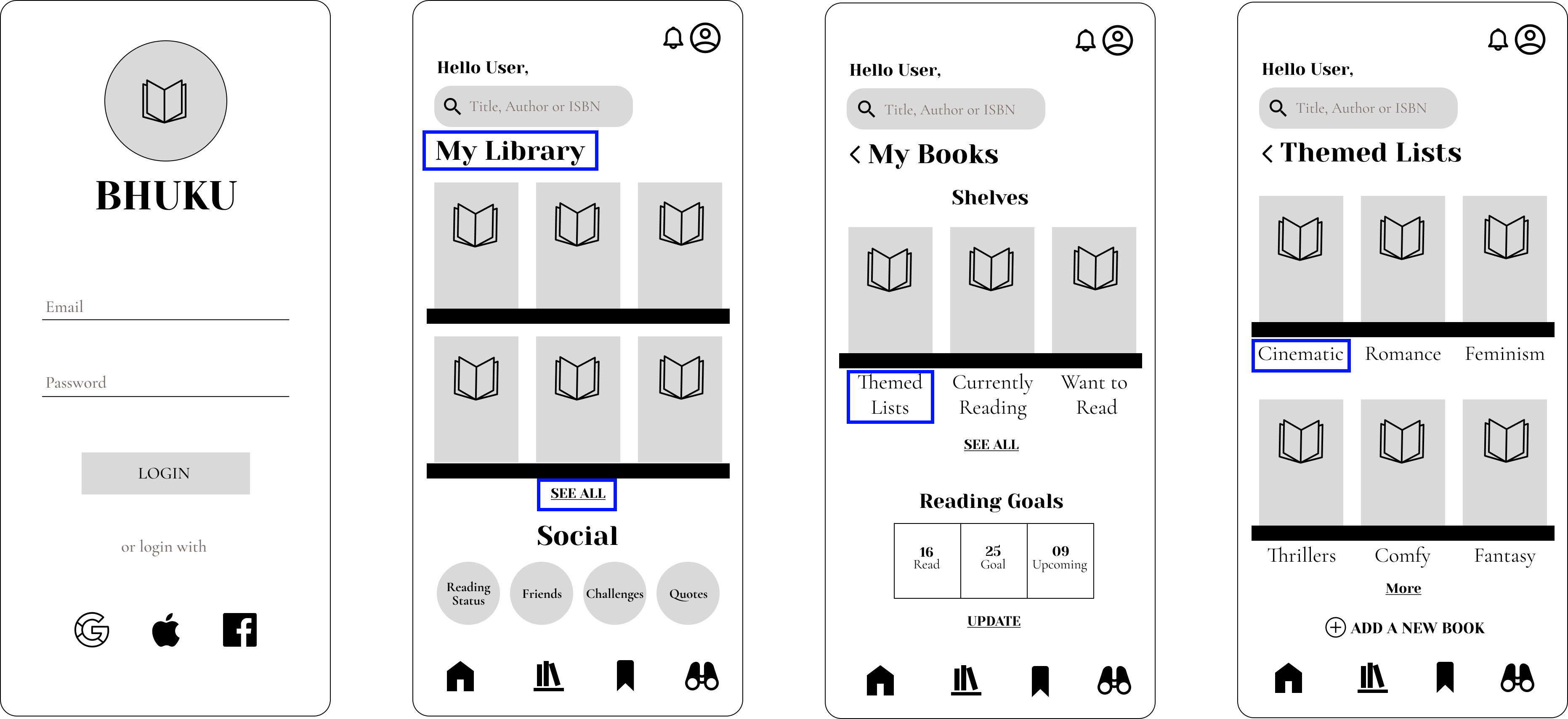
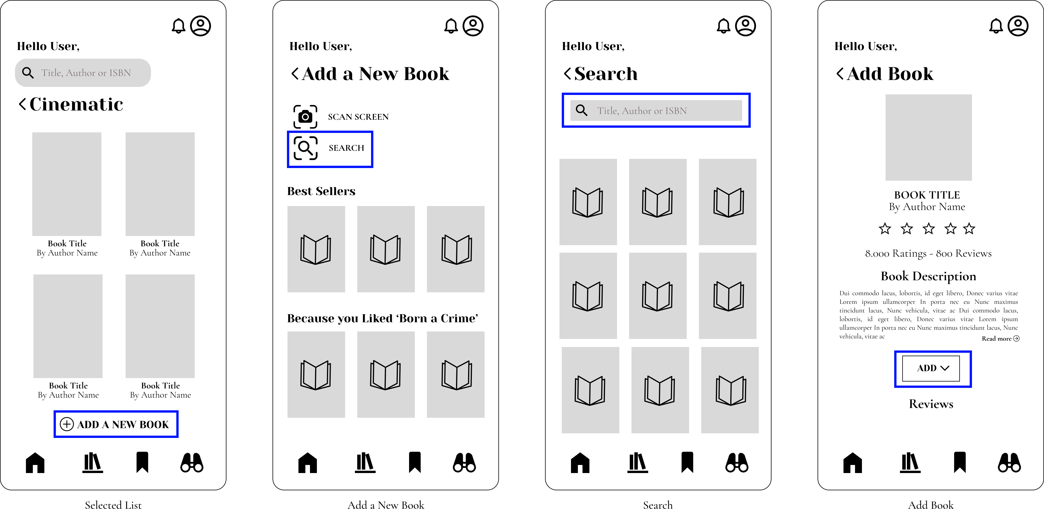
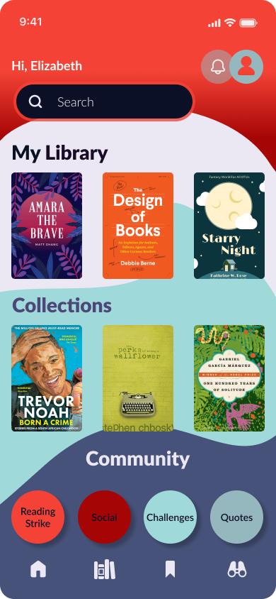
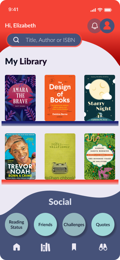
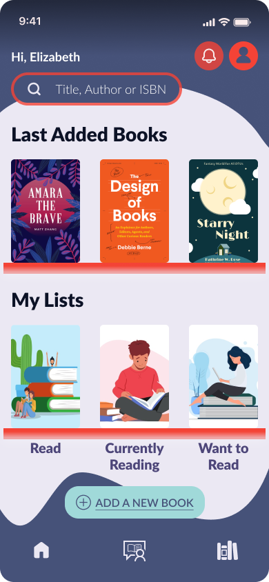
Alongside the interface, I developed Bhuku's visual identity, creating a warm and approachable brand through rounded components, inviting typography, and a vibrant color palette that reflects the joy of reading.
High-Fidelity Mockups
The final design helps readers organize their collections effortlessly while making discovering new books more engaging and inspiring.
 Version 02
Version 03
Version 02
Version 03
Testing & Iteration
Usability Testing
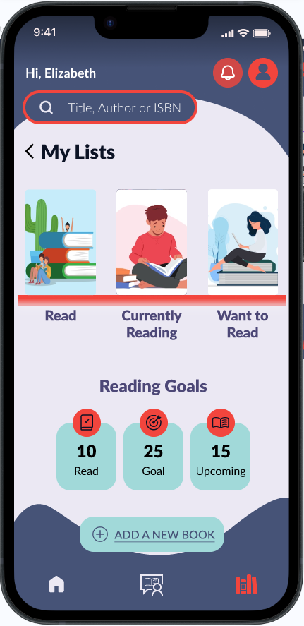
Five participants completed common reading tasks using an interactive high-fidelity prototype, including searching for books, saving titles, and creating reading lists.
Key Findings
Participants found the interface intuitive, visually appealing, and easy to navigate. They particularly appreciated the personalized discovery features and the clean organization of the library.
Testing also identified opportunities to improve navigation labels, clarify recommendation logic, and provide stronger feedback during organization tasks.
Design Improvements
Following testing, I made several refinements:
- Simplified navigation labels
- Improved visual hierarchy
- Increased visibility of primary actions
- Refined iconography
- Reduced unnecessary steps within key flows
- Improved spacing and consistency across screens
Which made the overall experience faster, clearer, and more intuitive.
Prototype
Conclusion
Challenges
The greatest challenge was balancing a rich feature set without overwhelming users.
Prioritizing features based on research helped maintain focus and avoid unnecessary complexity.
Lessons Learned
This project reinforced the importance of validating assumptions through user research and usability testing. Even small interaction improvements can significantly enhance the overall user experience.
Leading the project from research to final prototype also strengthened my end-to-end UX process by allowing me to lead every stage, from research to testing and final design. It also deepened my ability to translate user insights into practical design decisions while balancing business goals with user needs.
Creating a product that feels both functional and enjoyable to users is one of the best outcomes.
Next Steps
Future iterations of Bhuku could include:
- Reading challenges and achievements
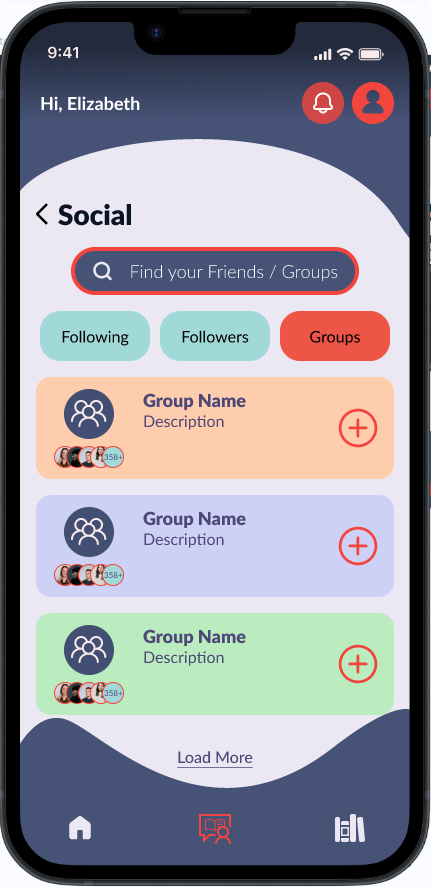
- Book clubs and social reading groups
- Barcode scanning for adding physical books
- Accessibility enhancements
- Expanded community features
- AI-powered book recommendations