Profile:
Practical and sentimental bride, newly engaged


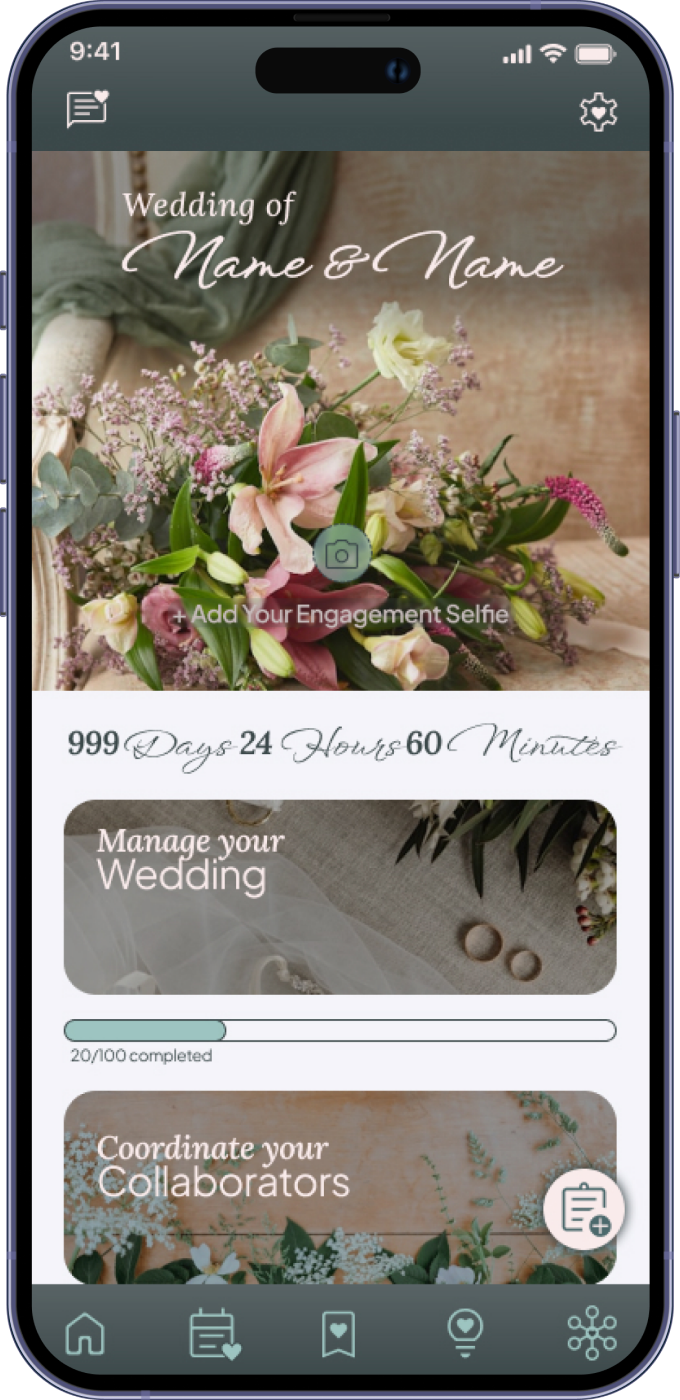
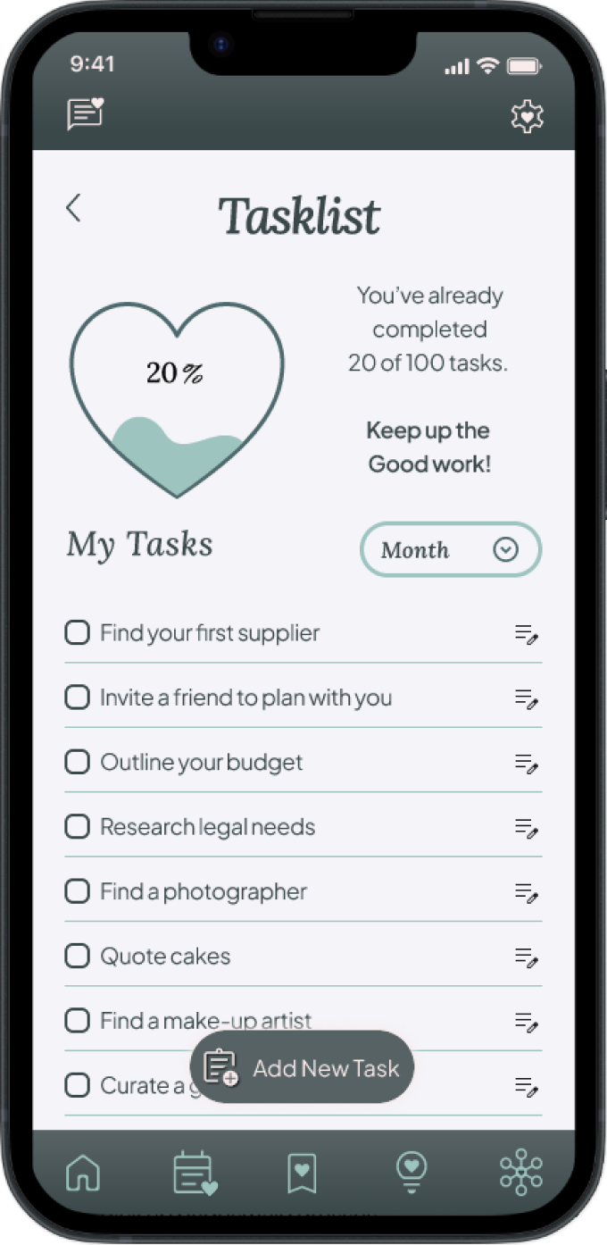
Simply Wed is a mobile application that helps couples simplify wedding planning by bringing tasks, budgets, vendors, guest management, and inspiration into one intuitive platform.
The project focused on reducing the stress of wedding planning through thoughtful organization and user-centered design.
Planning a wedding often requires juggling multiple apps, spreadsheets, emails, and notes, creating unnecessary complexity throughout the planning process.
The challenge was to design a centralized experience that makes planning feel organized, collaborative, and manageable.
To design an all-in-one wedding planning app that streamlines the planning process by bringing budgeting, guest management, vendor discovery, scheduling, and task tracking into a single intuitive experience. The solution reduces stress by helping couples stay organized and confidently manage every stage of their wedding journey.
Since I wasn’t very familiar with the wedding industry nowadays, specially in Germany, I began with some secondary research to gain a better understanding of the market trends and demographics. Then I conducted interviews to learn more about the different experiences people have had with planning their weddings.
 Weddy Place
 My Wed
 Bride Book
 Planner Templates
In order to learn about the real experiences people have while planning their wedding, I recruited 4 participants for user interviews. The profile I drew was of people who recently got married or are currently engaged and planning their wedding in Germany. I also tried to ensure a diverse mix of backgrounds, budgets, and regions.
To make sure that my decisions moving forward in the process are user-centered, I wanted to have a clear understanding of who Simply Wed’s users are. Using what I learned, I created two user personas to represent who I will be designing for.

Female, 34 years old
Lawyer, newly engaged
“I’m an organized person who thrives on structure and checklists, but also deeply value the emotional and sentimental moments.”
Practical and sentimental bride, newly engaged

Males, 35/37 years old
Designer and Teacher
“Our wedding is a celebration of love, shared with those who matter most. We seek a planning journey that is organized, collaborative, and truly ours. Every moment is meaningful.”
The low-budget-DIY couple, engaged
After brainstorming and coming up with many different ideas for the problems, I started to draw up a strategy to determine what goals I wanted to achieve and to help me prioritize the best solutions.
So first, I defined the project goals to have a clear understanding of the objectives and where the business and user goals align.
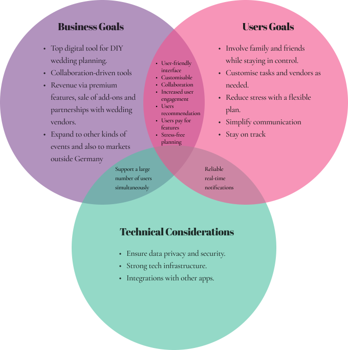
Thanks to the user interviews, the ideation process wasn’t that hard. They gave me great insight into what really mattered to the final users.
Since the main presented concepts kind of complement each other, I decided to move forward with the idea that focuses on the collaborative feature, that gives the option for users to add family and friends and manage and delegate tasks to them within the app, because it is super aligned with their needs.
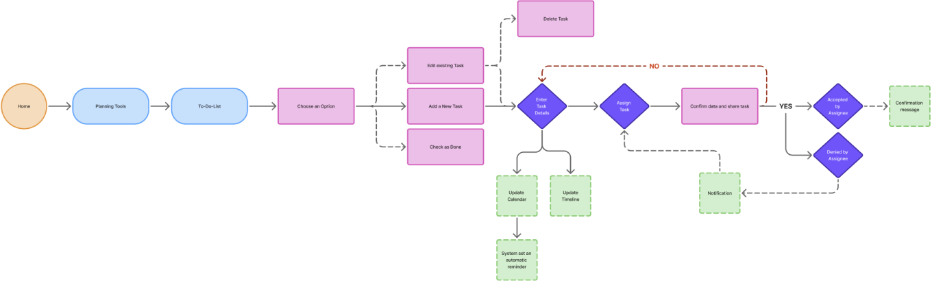
To guide my design decisions and have a better idea of how my users would interact with the app, I created the task flows for the main features I had in mind. This helped me map out the main user journeys and identify any potential pain points early in the process.


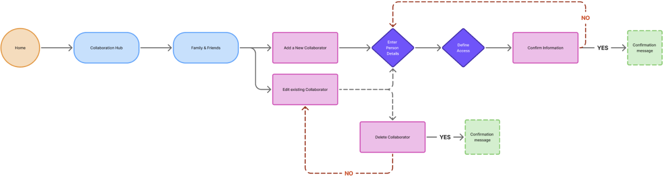
To go even deeper and better understand the journey my users would take, from start to finish, and to empathize more with the scenario and the paths they would take and the different decisions they would make to complete the main tasks, I made the User Flows.
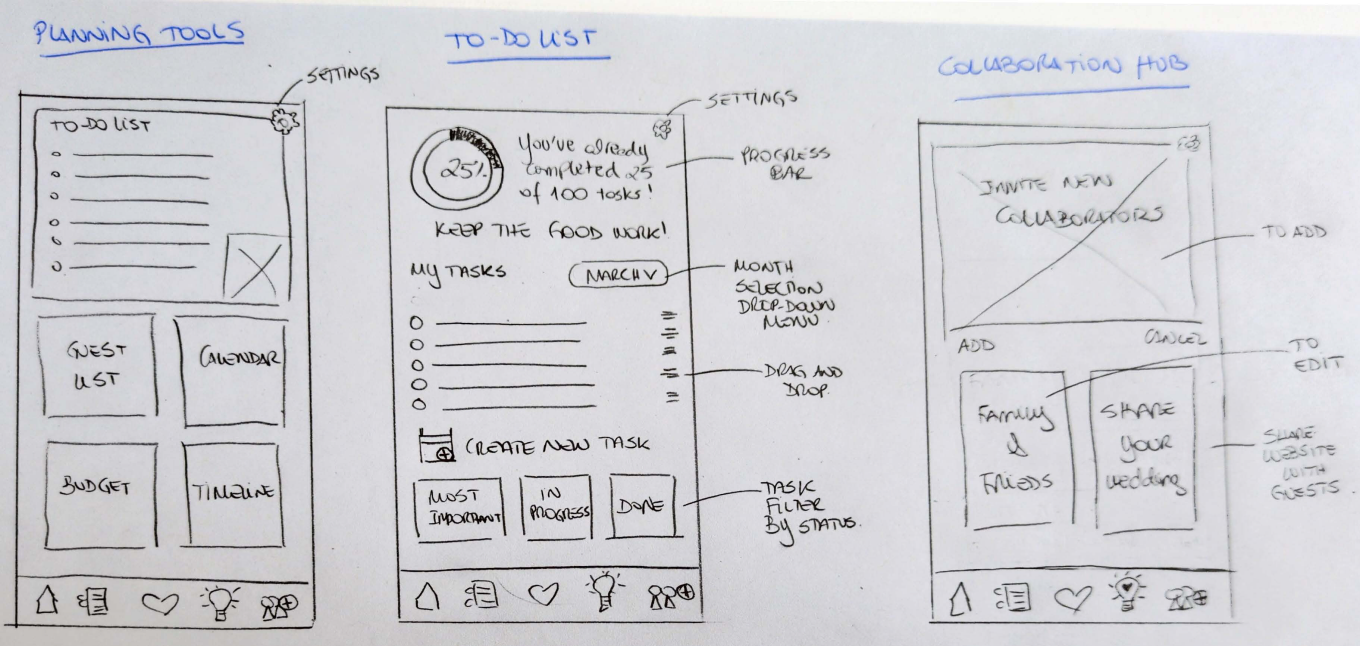
Using my understanding of the user, the goals and the architecture, I worked to make coherent decisions about how to design Simply Wed's screens, sketching low-fidelity wireframes
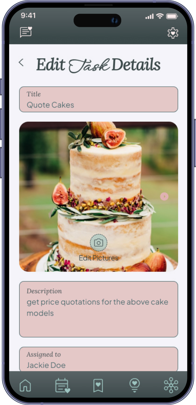
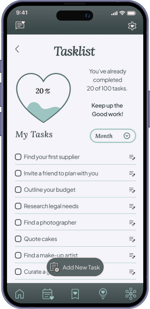
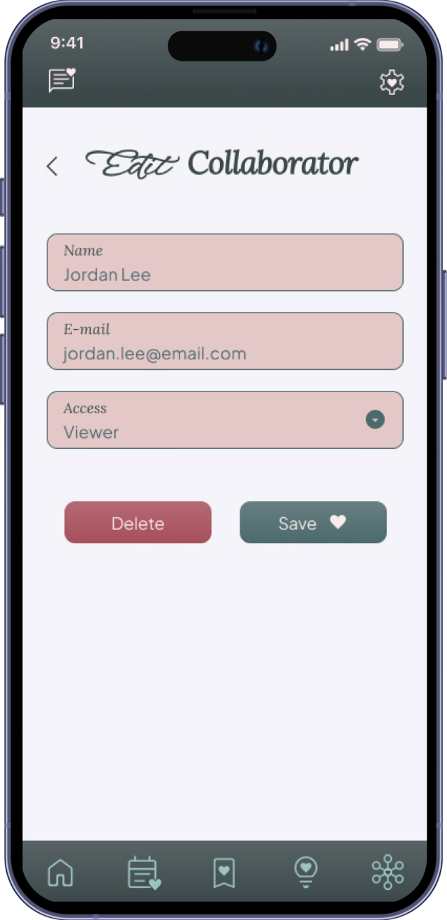
After sketching out the ideas, I wanted to test the decisions I had made and make sure that the structure and flow of the app was intuitive for users. To do this, I decided to create medium-fidelity wireframes, to help me check the design and make priority revisions before moving on to the next stage.
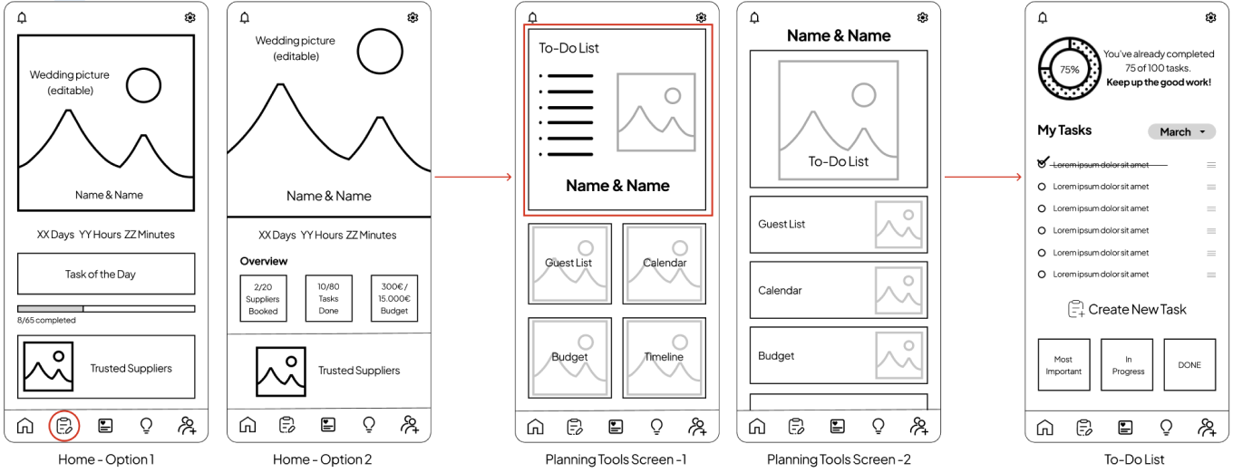
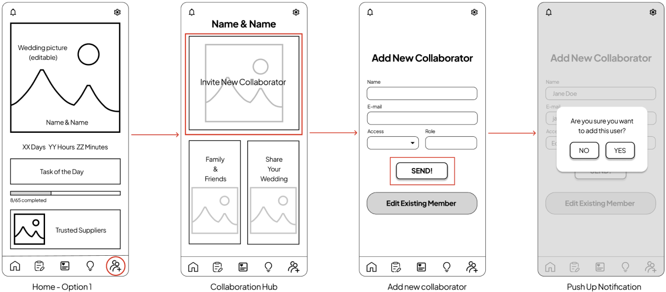
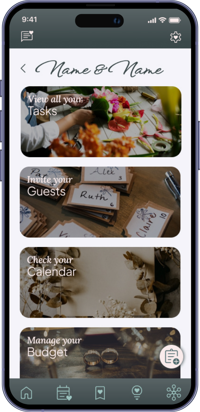
With my wireframes reviewed, branding, logo and style tile defined, I worked on creating high-fidelity wireframes and prototype.
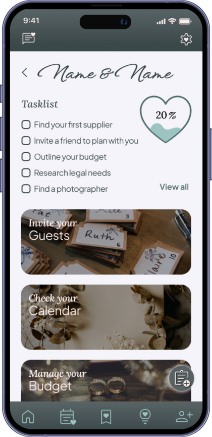
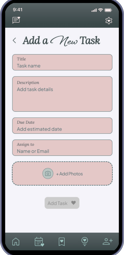
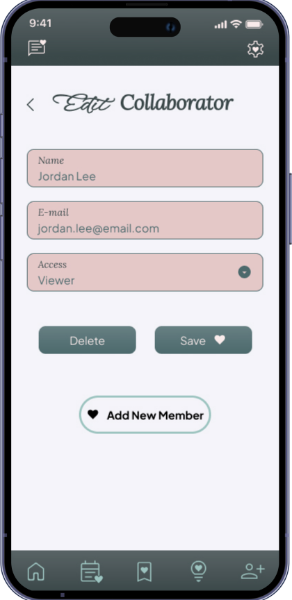
This usability test was conducted to evaluate the overall user experience when using key task flows within a prototype of Simply Wed and identify any usability barriers that might get in the way of a smooth experience.
Task Completion Time: Most users completed the tasks relatively quickly, indicating efficient design flow once users were in the task form.
Navigation patterns needed to be more intuitive.
Unassisted Success Rate: Only two users needed minimal guidance, mostly due to confusion related to prototype behavior (e.g., keyboard interactions).
Users struggled with finding where to start tasks like ‘editing tasks’ or ‘adding collaborators’.
Clarity of Flow: All users were able to complete the tasks once inside the appropriate form; initial navigation to the form was more challenging.
Menu symbols and text like ‘Check Your Task list’ caused confusion and did not accurately reflect the function.
Field Input Usability: No users had difficulty understanding or completing required fields. All found the information clear and easy to follow.
Clickable areas should be more obvious. Many users expected to click on task titles or collaborator names, indicating a need to align with common interface patterns.
Navigation Efficiency: This was a common pain point. Several users had trouble locating where to begin certain tasks.
Improve spacing and visual grouping in the UI, especially in lists. Users noted that sections felt cramped or lacked visual hierarchy.
Users Feedback
Overall, users liked the
visual design and described the tasks as generally
easy to complete once they were inside the correct
flow. The interface was described as friendly and
aesthetically pleasing.
Accessibility concerns (such as color contrast for color-blind users) should be addressed to meet inclusive design standards.
As someone who enjoyed planning her own wedding but isn’t a professional event planner, working on Simply Wed gave me the opportunity to dive deeper into the complexities of wedding organization from a design perspective.
Through both, secondary and primary research, I was able to better understand the challenges couples face when planning without expert support, especially the stress of managing multiple tasks, people, and deadlines all at once.
Building Simply Wed from the ground up was not only a rewarding learning experience, but also a chance to explore how design can truly simplify intense processes. It was especially fun to think about how to make the app collaborative and intuitive, so couples can plan together and stay aligned every step of the way.
This project reminded me how technology can support not only functionality but emotion, and I’m excited to see where Simply Wed could go next.